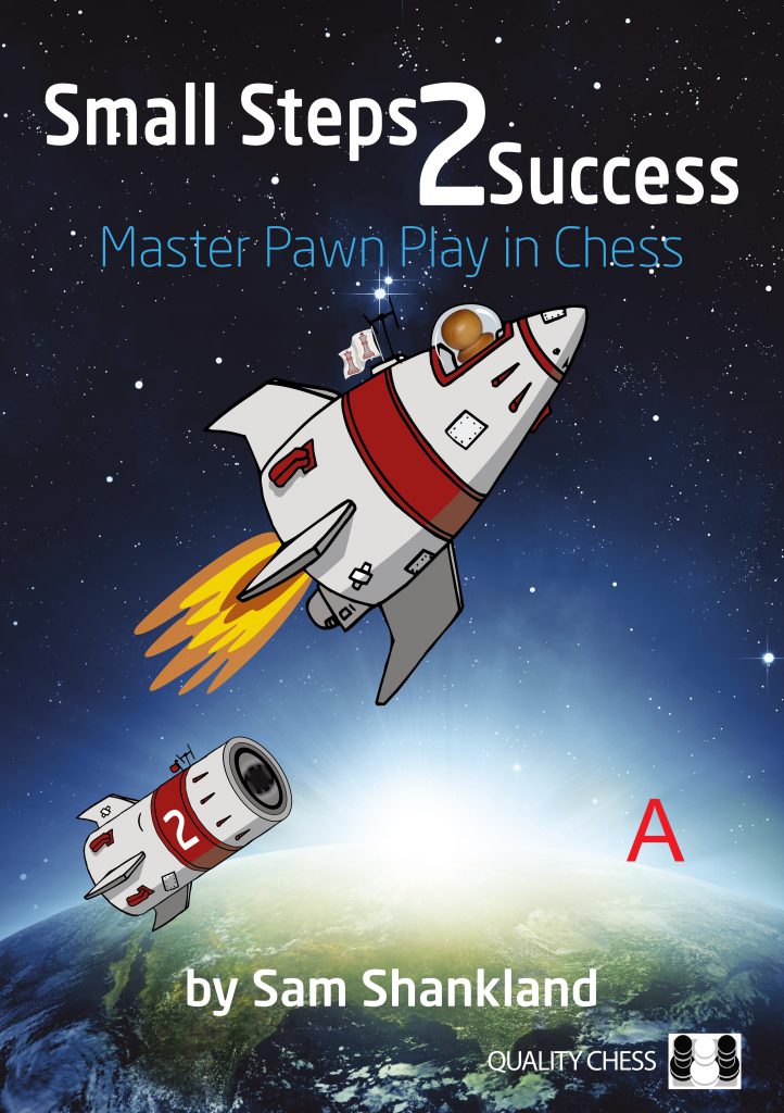
Small Steps 2 Success – Cover Discussion
Yesterday I worked on the cover of Sam’s next book, Small Steps 2 Success. As someone who has been teaching Maths and Physics for years, I know how I am supposed to draw this. But what makes sense in my former world, doesn’t mean it’s the best-looking cover. So, I would like to hear your opinions on which cover you like most. I know, small changes, but that’s what makes a difference after all!?
Kallia


Categories: Publishing Schedule
I thought B looks best, evoking a feeling that the rocket body has been dropped behind and the spaceship heads upwards, and at the same time the number “2” is more clearly readable. But now I feel it looks like the body is in orbit.
I don’t like A because both body and ship trajectories have a similar angle. And I kinda dislike C because the angle between body and ship is a tad… not sure how to say this, “aggressive”?
Right now D feels right. But ask me again in a couple of hours, and who knows…? 🙂
I prefer B rather than A. The idea of the booster rocket being separated is very clear in the picture. C and D both look wrong.
Go for option B 🚀
the dude likes D.
I prefer B over A.
Like the rest of the comments, I think C and D looks wrong.
All much of a muchness though if pushed A or B
Surely the 2 should be on the top of the rocket though and 1 on the booster stage has dropped off. Presume it is symbolising book 1 has pushed us so far and book 2 will now be providing the next boost or am I missing something?
I also prefer ‘B’, though I hardly think the other covers would result in lower sales 🙂 . Very much looking forward to this book by the way!
Off-topic: I saw Thinkers are going to publish a book on the Leningrad Dutch by Demuth in the end of august. Which made me wonder how Marin’s book on the same topic is progressing? Can you enlighten us a bit or is it still to early to tell?
I also thought B! It felt right.
But shouldn’t it be a picture of the moon landing? You know, “One small step for…” and so on!
I’m more curious as to whether the separated rocket launcher self-landed successfully back on Earth.
Looks like a Hergé comic , so C .
I prefer B, without any doubt.
@Pinpon
And of course we need to add a quiff to the pawn 🙂
All look good – great work! B is my favorite. Ship it. Pun intended.
I prefer D
C is the scientifically-accurate option right?
I prefer A as it looks like moving together with the rocket
B, but i am more interested when the book is released, the content and how many pages
I think that number 2 is wrong placed in the rocket
you are buying the number 2 book not droping it 🙁
I suggest B.
I think B looks the best.
@Mario
That is a good point. So what about labelling the dropped part with a “1” and the cockpit part with “2”… Other than that: D is my choice.
Regardless of which of the four you choose I won’t judge the book by its cover.
Alrighty then,
A: Looks like the rocket is following rather than falling from the ship – Creepy.
B: Aesthetically pleasing – Feels right.
C: Just looks weird – Confusing.
D: Looks like the ship just took a dump – Yuck.
So clearly it’s B by a mile, and unlike what one poster said such small details can and does affect sales. We wouldn’t want to have to rename the book Small Steps to Giant Losses (in sales that is).
@Topnotch
The comment was meant to be light hearted response!
C seems most appropriate, with the rocket blast causing it to spin.
@Tamz29
I choose C as well, but I guess all choices seem valid, seeing as they could be snapshots before it started rotating.
@ Michael
So we’re my comments. My quip regarding Book sales was in response to Ray’s post 6 or 9 I think, and not in response to you.
No hard feelings.
I think cover D makes the best use of the booster breaking away and gravity making it fall backwards. Without propulsion, it shouldn’t have the same trajectory as the rocket.
I want to know which makes the most sense according to physics. Guessing this is D, :|.
None working for me (sorry) you should stick to the same format as book 1, but this time have many pawns with rocket trails as they leave the planet. i.e phase one ( book 1) breaking thru the atmosphere phase two (|book 2) breaking into the endless vacuum of space .
must be chess pieces IMHO
Also marketing obviously makes a difference. A good example of this is the book Tactimania by Glenn Flear, which is a very decent puzzle book, with what I find quite fun and individualistic manga style illustrations. Most of the chess players I know have no interest in buying this book, because it is perceived as being a kiddy book, and they don’t want to be seen buying such a thing.
This attitude seems to be quite common because when Chess and Bridge in London last stocked this book, they were flogging off the paper editions for £5.
Will the coming soon section be updated anytime soon. Eager to catch a glimpse of the new Najdorf book and any others that may be in the pipeline!!
D
@John Christopher Simmons
The author asked us, no begged us, to use these illustrations. They are by his son!
@The Doctor
Hopefully people will like it, but I just want to clarify that Gelfand declined my offer a few years back…
So it will be Garri himself?
@Thomas
😂 That would be hilarious, but amazing.
I’d love to know who the author is. My but it’s a GM but not a very well known one!
I meant to say ‘My guess is it’s a GM but not a well known one.’
On page 67 of the excerpt under the left diagram shouldn’t it read “the first mistake is the one that makes the win easier….
No, it is right as it is. It is writing from the point of view of the stronger side of that position. So the first mistake by the winning side makes the win harder to achieve.