Two cover options
I just got these two as options from one of our cover artists. I would like to know what the public thinks. Please vote in the poll and come with further comments below.
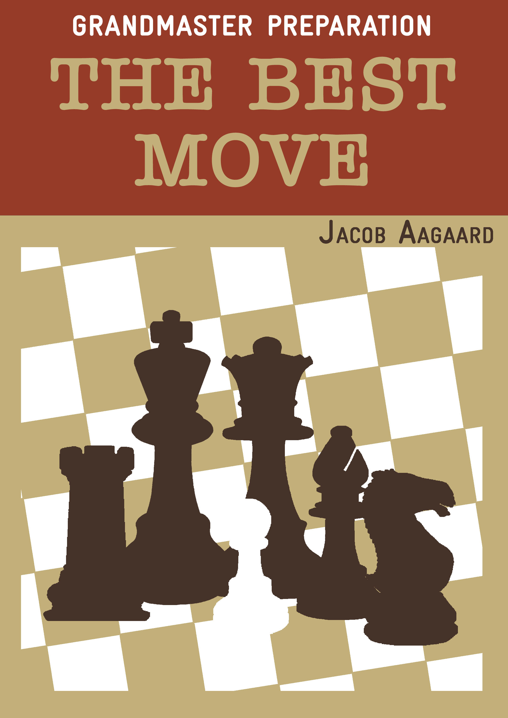
Cover A is the brown one, Cover B is the red one.

Categories: Publishing Schedule
In my opinion option A is more in line with the other covers in the series.
By the way, do I understand correctly that this is a new volume? If so, I’m of course very interested in the topic of this book!
I voted for cover A. Personally I like relaxing colors, which is not to demanding for the eye – thats cover A for me.
For me cover B is not easy to look at for my eyes. The red color is to sharp and the contrast with the white text, is not relaxing for me.
Cover B seems to me like “I need your attention” (concerning the red color) and I believe that you don’t.
You have high quality contents.
I hate cover B.
Cover B looks like it put on way too much lipstick on a Saturday night. I agree with the previous opinions – I prefer cover A by far. Though the white pawn is badly placed on that cover due to contrast issues.
Just like Ray, I’m also interested in the topic of the book!
Definitely cover A.
Hello All,
My pick is cover A, I concur with “Tobias” that the pawn is badly placed… On both covers, the tilted checkered background is visually unsettling but that is likely a personal eye problem :).
Cheers,
Not B
Cover A is the brown one is the ONLY choice 😉 :). You are very high Quality material in your books and that’s the reason you do not have to “shout” with the Cover B. And as Ray said: “more in line with the other covers in the series” – it is very important too.
I assume there would be at least 90% choice to Cover A – such a probability that goes to “the only one choice” 😉 :).
@Tobias
I agree with your comment on contrast which makes the white pawn on cover A badly visible. I would consider swapping the light and dark squares, so that they have the same arrangement as on cover B. Or otherwise maybe moving the white pawn a bit to the left or the right.
@Tomasz Chessthinker
Looks like someone is cheating with the voting then :-). Over 60% is in favour of cover B.
Cover A ! By large margin !
I agree. It’s easy to cheat: each time that I enter the blog I can answer the same question.
A for sure.
I concur with all earlier comments, especially concerning contrast, the white pawn which should come out more and the attention shouting red of cover B. Futhermore, I absolutely loathe Black’s pieces in red, because they are supposed to be… black!
I do find that the title stands out more in B – is it necessary to put “The Best Move” in the same colouring as the ‘black’ squares? Or could it be done like in B? GM Prep in black – The best move in white – Aagaard in black.
And yeah, given the poll stats, why don’t we get to read what a B-voter thinks?
Cover A for sure.
On a side note: Your Grandmaster Preparation series of 5 books is getting bigger and bigger- someone realized that it takes more than 5 books to become a GM?;)
Definitely A, even though I will also buy it if you should make the error of going for B!
Cover B looks like a book of Schiller. No need to add anything else.
Has to be A.
c) hire better artist
The brown cover looks more “serious” but I suspect the red one would sell better.
Cover A is the best for sure, just emphasize the contours of the white pawn to make it stand out.
By the way, I very much prefer more sober colors and really dislike shinny/bright “I want to be noticed” colors, so I will give you my opinion on some of your best and worst covers:
Good Covers:
Grandmaster Preparation Series ( Good Design and colors for the most part )
Chess Tactics From Scratch ( I would have prefered a slightly less intense blue )
Advanced Chess Tactics
Karpovs Strategic Wins ( Nice Photos )
Attacking Manuals ( The design is cool and according with the subject )
Pump Up Your Rating ( Nice, clear design, bad name )
Bad Covers:
Yusupovs Chess Course ( I like the design, but NOT the colors, tones too bright for my taste )
Carlsen’s Assault On The Throne ( Very cheesy, bad art and color in my opinion )
Grandmaster vs Amateur ( Cheesy )
Grandmaster Battle Manual ( Very bad colors )
🙂
It is hard not to notice that the pawn on the Cover A is hardly visible. White background and the same pawn colour – it is not so good mix. In my opinion it should be at least outlined or better still – changed colour into the colour of most pieces on the Cover B.
@Ray
At some monitors (especially older and dirtier ones) the Cover A is simply not visible ;). That’s why most “anonymous” voters has voted to the “only one visible” to them :). And take notice that an artist could have asked some of his friends and colleagues to vote for his taste of cover 😀
Cover A is better.
You need to (as FM To Be says) do something to make the white pawn stand out, as currently it seems to be the exact shade of white as the white square.
Although the chessboard in B looks more normal and the white pawn in B stands out better, nestling amid the red pieces, The overall impact of cover A is far “Classier” and attractive. There is one significant improvement needed for Cover A. As suggested by Tomasz Chessthinker, outline the pawn in black or in the dark brown already used in cover A.
Both covers OK but voted for A
I also prefer cover A. The slightly muted colors are more in line with other books in the series. In general I don’t like bright iridescent covers on chess books. NIC has been very guilty of this until recently.
Cover A is better.
Perhaps the white squares on cover A could be greyed a bit to make the pawn stand out?
Some responses have criticized the artist but for me this design is better than the photo of a board on other QC books, e.g. Berg’s two volumes on the French. I have a simple rule of thumb for covers: if my reaction is that I could do better myself, that’s not a good sign! The “photo of board” covers seem amateurish to me.
Cover A (Brown) More in keeping with the others in there series
Another vote for A.
Most definitely cover A
Cover A looks more like the other ones, so I vote for it!
if you switched the white pawn on cover A to the light red from above it, it may look alright
If the book is serious Work with well known tools: cover A
If the book is provoking new stuff: cover B
I actually like B most.
A is better than B EXCEPT for the fact that the pawn Blends in with the Light Squares. Make either the pawn or the squares what catalogs call “Natural”, similar to the light squares in option B, and A would be perfect.
As Option B shows, the dark squares don’t need to match the text in the title. Make the dark squares a little darker, and the light squares similar to the light squares in B, leaving the pawn White, or else make the pawn some form of color, leaving the squares as they are.
Option A, but make the white pawn red in colour!
Cover A. The other one is a bit too busy for my taste.
Striking colors are apparently too much for most of the posters here. Fittingly, only the follower of Bent Larsen likes the bold approach, besides me.
Sorry Pac I only just read your comment, which is basically the same as what I just said.
However I seem to remember in printing the more colours you use the more expensive.
So in option A & B there are 3 colours(includes black) on white.
If you use Option A, but use the brown from above to outline the white pawn so it does not blend in to background may be alright.
B, but change the red pieces and red title background to the deep mauve (?) of A. That way your colors are better balanced over the whole image. The red is like a punch in the face, while the more muted colors are much easier on the eye. Maybe change your name from black to white also, but without actually seeing it it is hard to say that is even necessary.
While cover A is more aesthetically pleasing, especially if the low contrast pawn problem is fixed as suggested by Ed, cover B will sell more books. Red is more attractive and more exciting color. This is one reason it is widely used in packaging and advertising.
Choose B if you have the opinion that the best move stands out in a position, otherwise choose A. I feel that B is not appreciated because we see it on screens.
If I have to choose between A and B: clearly A – B really hurts my eyes
However, overall I agree with Shurlock and opt for c: hire a better artist
I actually like also the white pawn difficult to see in cover A…as the title says “the best move” and we all know how much the best move is difficult to see… 😉
At first I instantly thought Cover A is nice, and Cover B is super ugly (reminds me of a 1970’s book for some reason)
But after a while I thought Cover B isn’t that ugly, but Cover A is definitely better.
Voted for A!
Cost is not an issue. It is either 1, 2 or four colours. Only to involve silver or gold goes outside the normal cmyk colours.
The number of post here clearly shows the preferences of QC customers.
The Color is what matters most.
So here’s my advice to QC: Get an expensive artist for the cover and hire Eric Schiller for the content! 🙂
I voted for A as well, and also dislike the white pawn. The white-pawn-on-white background is ugly, especially for a chess player. And the black rook has a strange base…the molding seems to leave a too large space (if you get my drift), which draws attention to it which is unintentional in my opinion. And I am also not seeing a relation between the cover and the title (except the obvious that moves are actions of pieces). The colouring resembles other titles a lot…seems like a good choice to me fitting the pattern.
And as a final note: it looks as if the king is shot from a different angle than the queen…is this intentional? As if it is leaning towards the viewer, while the Queen (and the bishop) is straight.
@Indra Polak I hadn’t noticed the angles but indeed there’s something slightly odd about them. With all pieces except the rook we see a rounded base, but the rook’s base is squared off. With the king and queen it seems as if the “shoulder level” rings are not at the same angle.
That said, it still seems fine to me the way it is. At some point you have to say enough is sufficient.
Cover A, it is!!
cover A! it is like a chess board!
Cover A
Both covers are awful. They look like some cheapo book by Keene.
If it has to be one or the other, then cover B by a mile. Cover A is as dull as dishwater and gives the impression that the contents will be the same. As a poster above said, cover B will sell better.
(I don’t wish to be an entirely negative person – I think the covers for the GM series are great.)
What some of the people are saying appears to be true. The angle of the pieces is not uniform it seems.
It almost appears as if you were using Rybka, and took the photos of the Rook and Queen in 2D view and the King, Bishop, and Knight in 3D View (you know how it shows at an angle when you put it in 3D versus a stand-up type screen in 2D?)
I like Cover B. It says pick-me-up !
I recognize that I’m in the minority when it comes to book covers – some of my favorites had absolutely ridiculous covers. Dearing’s Dragon book comes to mind.
Accordingly, I choose B, even though at this point it’s largely irrelevant!
Cover A. It’s a work of art.
I’d like to see the binding.
B. though IMHO neither of them are that interesting, wouldn’t a pictur with some people or actual position be more attractive?
maybe the color of the title could be a hair lighter, here I tried #e1c4a2 (this is a quick mock-up – disregard that the letters of title appear jagged):


please let meknow when this book will be published’….best
Cover A but with a RED pawn. Thats all !
I have a book with exactly this name which is absolutely awesome. Will yours be similar? Or is it going in a different direction?
http://www.amazon.com/The-Best-Move-Vlastimil-Hort/dp/0890580413/ref=sr_1_2?ie=UTF8&qid=1400728879&sr=8-2&keywords=the+best+move
No, it is just a tribute. Anyway, it was just the cover designed that came with some covers for potential future books and I had to put a title on. I like it though.
OK. The one on the left looks too much like Positional Play. The one on the right is more striking but I’d save it for your final book in the series as it looks like the boss.