Fischer – Spassky 1972
Tibor Karolyi is working on his follow-up to The Road to Reykjavik, titled Fischer – Spassky 1972. Publication will be later this year, which of course is 50 years after the famous match.
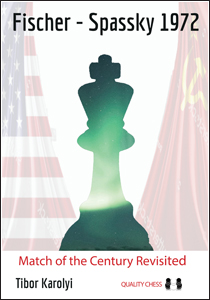
But the topic today is the cover: above is a version of the cover design so far. What do you think of it?
Categories: Publishing Schedule
Graphics looks good to me. But Jacob said on Facebook the book would also cover the 1992 match. Which if correct the title seems a bit off…..
I’d really love to see the Karolyi year-by-year game by game
Treatment on Botvinnik and Spassky
I really don’t like the blue/green/red combination. The graphics look good though.
Really like this cover.
Two questions:
1) Any idea when we will get a new PDF of the 2022 Publishing Schedule?
2) Any news on the From Scratch series?
Thanks
I would suggest to fill in the white space between the flags and underneath the title with the Aurora lights that is hinted on the piece. Also the flags could be made a bit darker.
Not bad, but I think something like the one of this t-shirt would be better.
https://marcmalgani.wixsite.com/misitio/product-page/1972-world-championship-infantil
Paul – the book does cover the 1992 match so you’re correct to point out that the title doesn’t reveal all of the content. However, rather than being too literal with the title, we prefer a short and punchier title emphasising the primary topic. The 1972 match is the event which we’re commemorating 50 years later, and the match that the chess world really cares about.
The champion was Spassky so I think it should be Spassky – Fischer instead of Fischer – Spassky.
Looks a bit ugly to me ( personal taste I know).A picture of Spassky and Fischer would be great
@Andrew Greet
Thanks Andrew. As background, Fischer considered the second match a greater achievement. 30 years is a round number anniversary on that too.
But happy you are covering it and look forward to buying the book, irrespective of what you put on the front cover. I’m hoping someone does a nice commemorative repro of the 72 set too.
Love the cover and glad the 1992 match is in there as well.
I grew up with the first match and really hoped the 1992 match would lead to bigger games with the two K’s
after Fischer won.
Sorry guys a big miss for me – rather odd not to have a picture of the 2 protagonists . The king is a bit overemphasised. I’m sure the content is excellent.
I’d rather see the players on the cover instead of flags.
To be honest, I’m not wild about it. Looks a little sparse, washed-out, and the solitary green king doesn’t do anything for me. Maybe work Iceland in somehow? I know a lot of things have been done already.
@Andrew Brett
That sounds a bit like when people say that modern art does not look like what it is portraying 🙂
The northern lights are a nice conceptual touch. but I’m concerned about the balance of the “weight” on the page, with the light flags on the sides not balancing the dark king in the centre.
I would much rather see a photograph of Fischer and Spassky on the cover.
Agreed. I am not a fan of the green king either.